


Your landing pages are the moneymakers in your PPC campaigns.
Or at least they should be. They’re the deal-closers. The sweet-talkers. Your online, 24-hour digital sales force.
Even if your PPC ads are driving high-value traffic, you’re wasting money on every click if your landing pages don’t convert that traffic into free trials, paid users, or revenue-generating leads
High-converting landing page ideas come from many places– client interviews, customer feedback, your marketing team, and your competitors. At iSpionage, we’re big fans of that last one.
We believe that competitive research is the fastest way to get high-quality conversion ideas to boost conversions on your PPC campaigns.
Showing you exactly how to do that is what the Landing Page Showdown is all about…
See How To Get Pre-Tested Conversion Strategies (for your niche) In Minutes
Welcome to the iSpionage Landing Page Showdown, SaaS Edition!
Today, we’re going to break down the landing pages of two SaaS giants in the file transfer and document storage space:
Dropbox and ShareFile.
Come along with us as we systematically analyze the core elements of their landing pages for you.
We’ll show you what each page is doing right and what mistakes they might be making.
And we’ll tell you how we would use this research to create a better-converting landing page.
Okay, let’s get to it!
Dropbox vs ShareFile
Keyword Details:
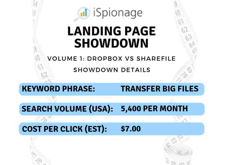
The Pages:
(click an image to see the full page)
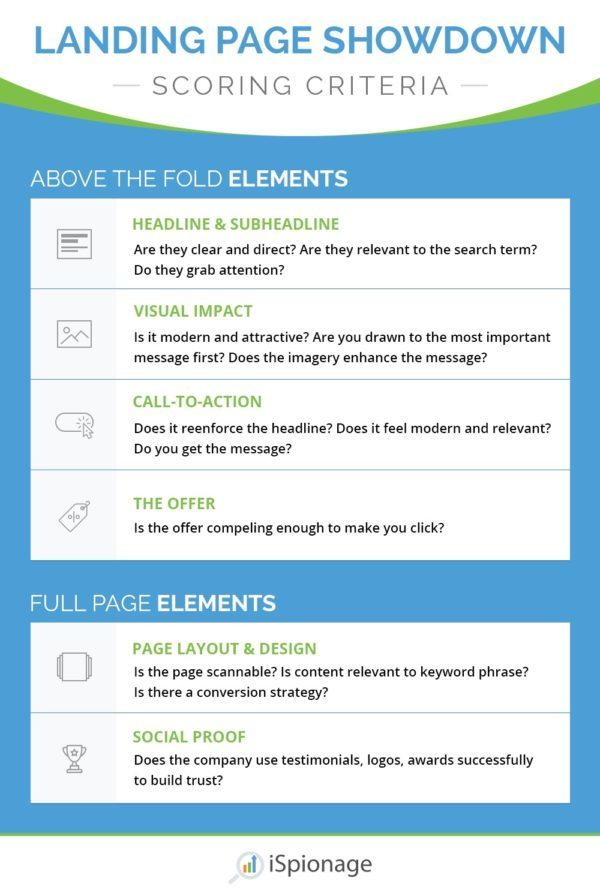
Criteria #1: Headline & Subheadline
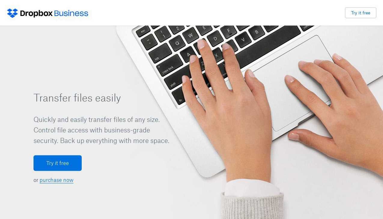
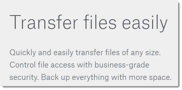
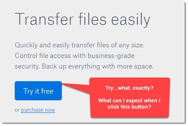
Clarity always is the most important quality in a landing page headline. And Dropbox scores some early points with a straightforward headline: Transfer files easily.
 Any questions about what they do?
It’s not fancy. It’s not clever. It just works.
They do call out “files of any size” in the subhead but they don’t mention “large” or “big” files. That’s a missed opportunity to tell the visitor they do exactly what they’re searching for.
Remember, the more you target your PPC landing page copy to your specific visitor (and the specific PPC term), the better your pages will convert.
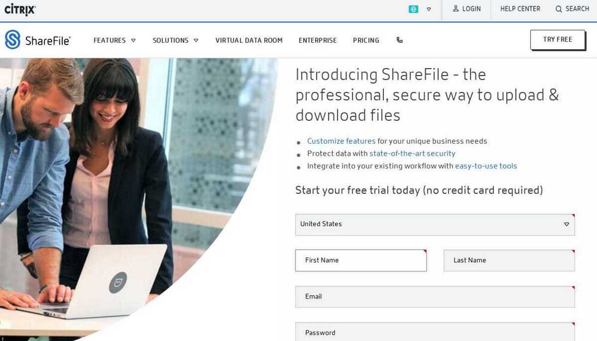
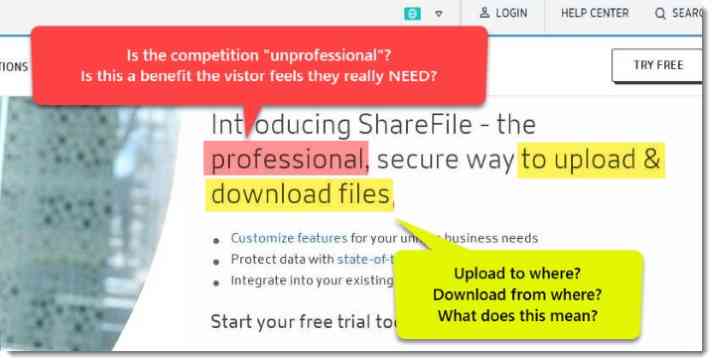
ShareFile takes a less direct route and introduces itself with all the charm of an awkward teenager at a party:

“Introducing Sharefile.”
Well, hello there, ShareFile!
Your name was on the ad that I clicked…
And it’s right there at the top of the page…
You don’t need to introduce yourself, I already know who you are…now tell us what you can do for me!
Leading off your headline with your brand name is a conversion-killer. Instead, talk about what you’re going to do for the customer.
Your visitors didn’t come here to make friends. They’re not impressed by your name. They came here to transfer files. Specifically, large ones. So get to the point…can you help them or not?
Even when they get around to the point, the ShareFile headline struggles to clearly communicate the value they offer.
 Every word matters in your headlines. Make them count.
“the professional way to upload & download files.”
Do you know what that means? Is there an unprofessional way to upload something?
Upload files to where exactly? And download files from where?
Are they trying to say “transfer files”?
If so, just say it! I mean, it is what their visitor was searching for, after all!
Speaking your visitor’s language makes your visitors feel like you understand them. People don’t talk like this headline…
Wait, what’s that sound?
Why, I think it’s the sound of “back” buttons clicking (or it could be the sound of $7 going down the drain, it’s hard to tell).
Winner: Dropbox
Recommendations (ShareFile):
- Test some simple, clear headlines.
- Talk about the product benefits in language the customer might use.
- Include the search term in the headline rather than inventing “clever” ways to say the same thing.
Visual Impact
Sharefile has WAY too much going on at the top of their page.
- Double-stacked branded navigation bars
- Pull-down navigation menus
- A login button (if I have an account, why am I here?)
- A search field
- And a bunch of other unnecessary stuff…
All that noise makes it too hard for your eyes to find the headline. And the headline should be the MOST important piece of content on the page.
Plus, all those links gives visitors a dozen opportunities to click away. Once they leave, they get lost in your site and the chances of conversion take a nose-dive.
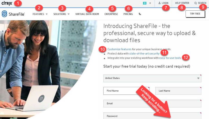 12 links to click…yet no CTA button in sight!
If you offer your users a way out of your landing page, they will use it. And they’ll take their conversion (and your $$) with them.
The ShareFile registration form is also over-sized and awkward. It straddles the fold and dominates the visual space.
Dropbox, meanwhile, checks in with a familiar look that practically screams “You are on a SaaS website now!”
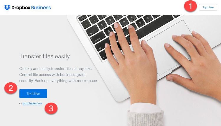 3 options to click. They all lead to a desired conversion.
The generous spacing and use of white space bring your eyes to what’s important: The Headline and CTA.
The grey on grey headline font is a bit subtle. They could test a darker or bolder text color to make it pop a bit more.
Neither page adds much value with photos. If you cover up the text, either one of these pages could be a landing page for pretty much ANY software solution.
Winner: Dropbox
Recommendations (Sharefile):
- Clean up the space to let the headline be the star.
- Experiment with sizing and location of the registration form.
Call To Action:
Like everything above the fold on this page, the Dropbox CTA is clear, simple, and understated.
It is brand-consistent but I’d like to see the button text stand out more. They could test adding more text, capitalizing the first letter of each word, or trying a bolder button color.
The first thing that irks me about ShareFile’s CTA is that the Start My Free Trial button falls below the fold.
“Straddling the fold” can encourage users to keep scrolling and explore what is below the fold. But that only makes sense if users want to see what is down below.
In this case, there isn’t any reason to keep scrolling unless you want to complete the form (which I’m not compelled to do yet). It feels like a mistake and I don’t see a possible positive impact on conversion.
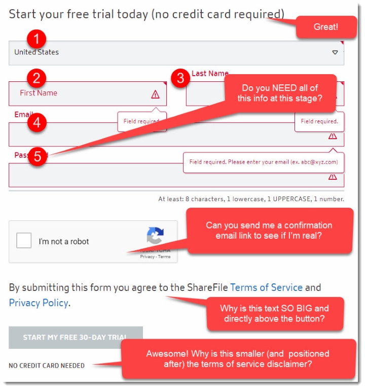 This form has a lot going on. Are you ready to commit to all of this?
The required fields on the form also feel excessive for a SaaS signup, especially the “Create A Password” field…
I just met you, remember? I’m not ready to commit yet. Tell me a bit more about yourself before you ask me to create a password.
Winner: Dropbox
Recommendations (Sharefile):
- Test a form design that doesn’t straddle the fold.
- Test a simple button leading to a separate registration page.
- Test reducing the number of form fields.
- Shrink conversion-crushing disclaimer text and move it to below the button.
The Offer:
Both solutions present a Free Trial offer, which is pretty standard for a SaaS solution.
The ShareFile trial is for 30 days and doesn’t require a credit card.
The Dropbox free trial…is a bit of a mystery. There are no details beyond the button text: Try it free.
Dropbox does require a credit card (I peeked), so it makes sense to not call attention to that. But they could at least mention how long the trial lasts, right?
 Offer specifics on the trial offer to overcome
resistance and nudge visitors to make that click.
Winner: Sharefile
Recommendations (Dropbox)
- Test Button Text:
- Try It Free For 30 Days
- Try Dropbox Free for 30 Days
- Transfer Files Free for 30 Days
Page Layout & Design:
Dropbox isn’t going to win any creative web design awards with this one. But that’s okay, it’s clean, clear, familiar, and easy to read.
SaaS companies use this type of simple layout because it works.
The subheadlines in the body are scannable and speak to customer benefits. I’d like to see the text blocks under the subheads be more concise, but other than that it looks strong.
They also close strong with a second CTA (for the same offer) at the bottom of the page.
If the visitor has made to the end of the page then they’ve learned a lot about you. They’re warming up to you. So tell them exactly what you want them to do!

 Which of these is more likely to generate a free trial conversion?
The Sharefile page starts off on the wrong foot, as we talked about earlier.
The top navigation bar needs to disappear. And there’s no reason for all those menus (or any of them, really!) on a landing page. People don’t come to a landing page to log in to their account. All those links just chase away traffic you paid to bring here.
The crossheads in the body of the page mention their client base, collaboration, and working smarter…somehow, not a single headline or sub-headline on the page uses the keyword phrase “transfer files!”
Finally, why end the page with more links that take visitors off the page rather than another call-to-action?
If your visitor made it this far, maybe they’re ready to give it a try. But they’re definitely not going to it if you don’t ask them to.
Winner: Dropbox
Recommendations (Sharefile):
- Lose the Citrix navigation bar.
- Get rid of the navigation menus, the sub-headline links, and end of page links.
- Rewrite body sub-headlines to talk about “file transfer.”
- Add a second CTA to capture end-of-page conversions.
Social Proof:
ShareFile is banking on social proof to put them over the top– and they’ve certainly got a lot of it.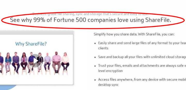
99% of Fortune 500 companies is a lot!
Do 495 companies out of the Fortune 500 really use ShareFile?
If, so, do they all love it?
It seems improbable, to be honest. But I’ve got no evidence to dispute it. And it’s impressive, especially if they’re targeting an enterprise customer.
The Awards section isn’t pretty but there is some good-looking (virtual) hardware in there. It’s smart to call attention to it.
Dropbox takes an “everybody’s doing it” approach to social proof by calling out the 200,000 (!) businesses that use their product.
Nice work, that’s a big number.
Plus, they have an impressive logo roll to back that up. I’d like to see those logos jump out at me a bit, though. Spotify, Under Armour, Kayak– those are recognizable logos, don’t make me squint to see them!
Winner: ShareFile
Recommendations (Dropbox)
- Test increasing customer logo size to get credit for them.
- Test the page with a few testimonials from customer high-profile clients.
When You Research Competitors, Everybody Wins
Dropbox comes wins the first iSpionage Landing Page Showdown by a final score of 4-2.
But it didn’t feel that close, did it?
Here’s the thing: even the winners of a showdown can learn from the competition.
You may be doing a lot of things right, but there are always concepts, offers, and persuasive techniques that you can snag from your competitors.
That’s the case for the Dropbox page and it’s true for your landing pages too.
Okay, that’s a wrap on Landing Page Showdown: SaaS Edition!
We’ll be back with a new Landing Page Showdown for you next week, so we’ll see you then!
Want To Do Your Own Landing Page Showdowns?
All the landing pages you’ll see in the Landing Page Showdown were discovered using Campaign Watch by iSpionage.
Campaign Watch automates your competitive research to save you time. We crawl the web twice a week to grab all PPC ads and landing pages that your competitors are using.
Just tell us what competitors and keywords you want us to track. Each week, your account will fill up with screenshots of ALL your competitors’ landing pages. Just go in and browse to see exactly what they’re doing to drive business.
You’ll even get updates when your competitors add new landing pages so that you never miss a beat. And Campaign Watch recreates their full PPC conversion funnel for you– from keyword phrase to PPC ad to the landing page.
Find out just how easy it is to use your competition to make YOUR campaigns stronger!
Learn More about Campaign Watch