


At this point, it’s a little early to tell which presidential candidate is winning the digital marketing battle because campaign marketing teams are keeping their cards close to their chest.
But one thing we do know is that digital marketing, and A/B testing specifically, can have a big impact on presidential campaigns.
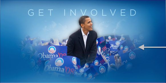
For example, Optimizely reported that A/B testing helped President Obama raise $60 million during his first run for office.
That’s a staggering amount of money and goes to show how beneficial A/B testing can be for candidates and businesses alike.
What’s even more interesting is that Kyle Rush was involved in Obama’s second campaign and wrote about how they ran 500 A/B tests over a 20 month period and increased donation conversions by 49% and sign up conversions by 161%.
That may not seem like a lot, but a 49% increase in donation conversions can have a big impact on who eventually becomes president of the United States of America.
The primary conclusion to draw from this is that digital marketing and A/B testing in particular is becoming more and more important for presidential campaigns. It’s no longer just about who plays the most television ads. The war is now being won by candidates who drive the most visitors to their website and who can generate the most campaign support and funds from those visitors.
So which presidential candidates seem to be doing a good job, and which ones have more work to do to catch up?
The Methodology
To help with answering this question, I’m going to use iSpionage’s webpage and A/B test monitoring feature which allows businesses (or candidates) to monitor competitor websites and campaigns in order to gain marketing insights for their own campaigns. This service is typically used by larger enterprise companies, but it also fits in very well with the world of presidential campaigns.
I’m also going to look the most closely at the top candidates, namely Hillary Clinton, Donald Trump, Ben Carson, and Carly Fiorina.
The sections I’ll compare are:
- Design
- Conversion optimization
- A/B testing
- Campaign slogans
Up First: Design
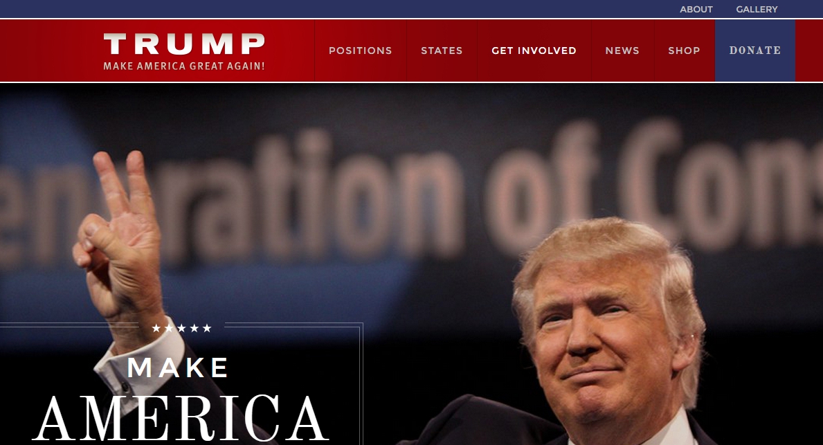
#1: Hillary Clinton
Democrats have proven to be very adept at implementing digital marketing strategies, as witnessed by the Obama campaign A/B test results mentioned above.
This shows in her web design which is clean, simple, easy to read, and pleasing to the eye.
Here’s a sample image of what her site looks like:
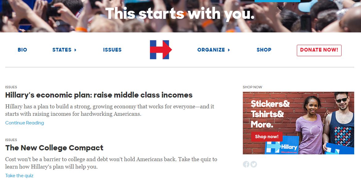
She also has an excellent logo that indicates making progress and moving forward.
![]()
Overall, the Hillary Clinton campaign has done a great job from a design perspective.
#2: Dr. Ben Carson
#3: Carly Fiorina
Not surprisingly based on her tech background, Carly Fiorina’s website also a great design. It’s very modern and features a background video across the main space at the top of the site which is becoming more and more popular (although just because it’s popular or trendy doesn’t mean it’s a good idea). I personally don’t like the video effect since it distracts from the message written on the page, but the design overall is very good and makes Carly look current, with it, and up to date.
#4: Donald Trump
Of all the candidates, Donald Trump has the weakest web design in my opinion. It’s got an older, not modern, not up-to-date with current design trends feel to it. I’m also not a big fan of the colors, especially the drabby maroonish color that’s being used. Overall, the design seems stale, and the colors don’t strike me as being as vibrant and energetic as the other candidates, despite Trump’s claims of “high energy.”
Here are my final design grades by candidate:
- Hillary Clinton: A
- Ben Carson: A-
- Carly Fiorina: B+
- Donald Trump: C-
Up Next: Conversion Strategy
Believe it or not, design isn’t the end all be all when it comes to digital marketing.
A lot of people think that design makes or breaks a website, but that simply isn’t true. Design has an impact on a websites performance, but what really makes or breaks a site is how well it’s optimized to convert traffic into leads, supporters, sales, donations, etc.
Let’s take a minute to look at the conversion strategies of each candidate to see how well they’re doing in this area.
#1: Hillary Clinton
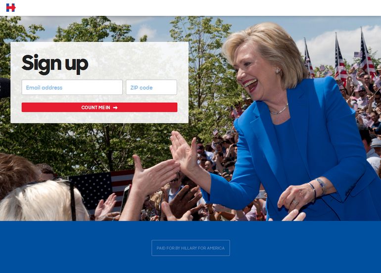
When you land on Hillary’s website, you quickly see two calls to action, “Join Us” and “Donate Now.” Both are worded strongly and effectively, and both represent the top two conversion goals for the website with joining coming first and donating coming second since it’s much easier to convert someone to join than it is to convince them to donate, yet once they join, you can always use an email drip campaign to convince them to donate.
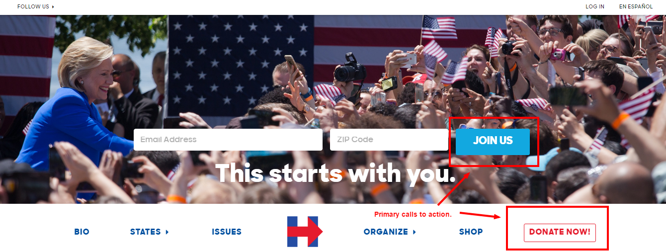
Note: Calls to action (CTAs) work best when strongly worded with an action verb. With this in mind, these two CTAs are great examples of how you want to write CTAs in order to get people to take action.
What’s even more interesting is that we recently detected with our webpage monitoring feature that Hillary added a splash page that asks for people to join and donate before they even land on the homepage. This helps to focus attention 100% on these two primary CTAs and seems to be working quite well. So far, she’s the only candidate who’s using this type of splash page.
Here’s what it looks like:
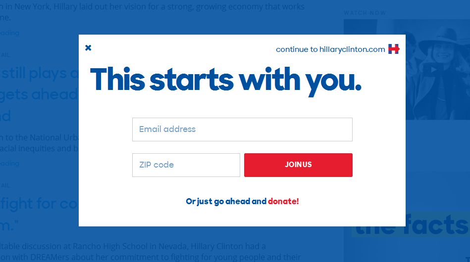
This is a really smart move by Hillary’s campaign team and something I wouldn’t be surprised if the other candidates end up copying soon.
The headline for this splash page also does a great job focusing on the visitor as the hero and how they can participate versus focusing all of the attention on Hillary. This works well because people are always interested in themselves and by nature people are looking for community and a cause to join. This headline works very well with that in mind.
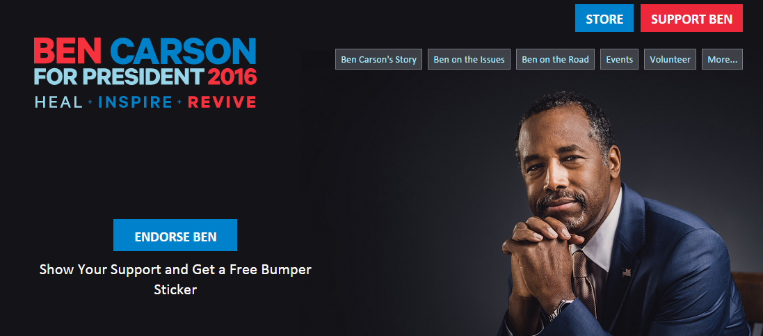
#2: Dr. Ben Carson
Dr. Carson’s team does a decent job highlighting calls to action on the homepage, but not a great job. They don’t have a lead form where visitors can enter their information right on the page, and I’m not quite sure what “Endorse Ben” and “Support Ben” mean. Do they want me to donate? Do they want me to give my email address? I’m note quite sure.
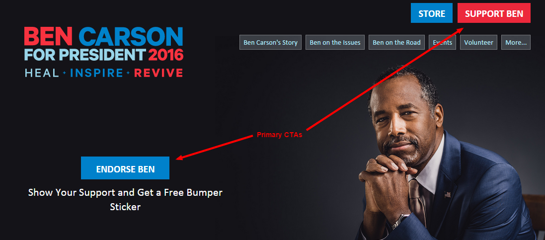
My recommendation for this page is to add a form where people can enter their email addresses and also to make these CTAs stronger, more clear, more prominent, and more explicit.
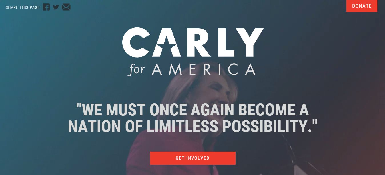
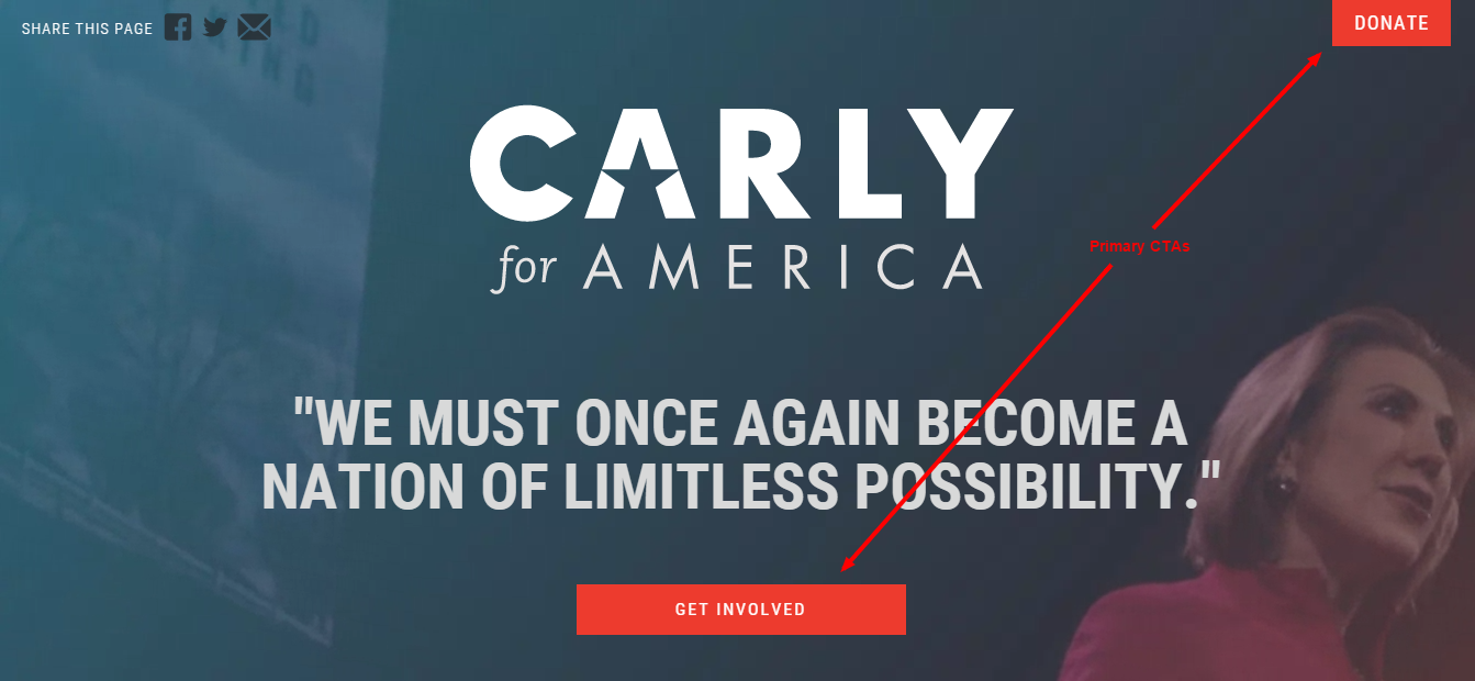
#3: Carly Fiorina
Carly has some of the same problems as Dr. Carson. Their isn’t an email sign up form on the page to capture email addresses immediately, and her CTAs aren’t as strong as Hillary’s. I’m just not sure what “Get Involved” means, and “Donate” could be made stronger by changing it to “Donate Now.”
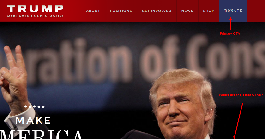
#4: Donald Trump
The Donald has even more issues than the previous two candidates. The “Donate” button in the header is faded and muted and doesn’t out the way a CTA button should (Pro Tip: CTA buttons should use an accent color that attracts attention, not a muted color that causes it to blend in with the rest of the site). His “Donate” and “Join Us” buttons are also pushed below the fold which is never a good idea.
Here are my final conversion strategy grades by candidate:
- Hillary Clinton: A+
- Ben Carson: C
- Carly Fiorina: B-
- Donald Trump: F
Which Candidates Are A/B Testing?
Here at iSpionage, we recently released a new feature that monitors competitor A/B tests, which means if you want to know what page elements competitors are testing, you can now do so with Campaign Watch by iSpionage. For this section, we’re going to show you what this looks like by evaluating the A/B tests that each candidate has been running.
#1: Hillary Clinton
One interesting test that Hillary’s team ran is a red background versus a blue background for the splash/overlay page when people first visit the homepage.
At this point, the blue background seems to have won out, and you can see a side-by-side comparison of the two pages in the image below.
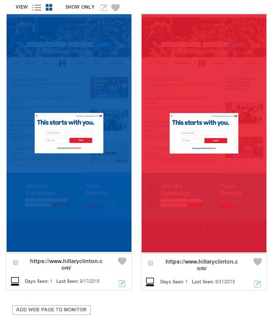
Note: This screenshot was automatically captured with iSpionage’s Campaign Watch feature set by adding www.hillaryclinton.com as a page to be monitored daily for changes.
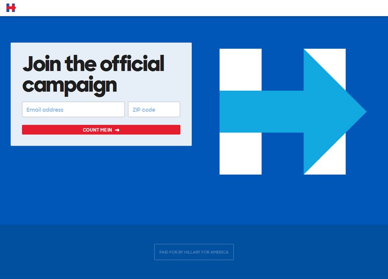
Another test they’ve run is on their PPC landing pages. The first test was a headline test between “Sign Up” and “Join the Official Campaign.” Take a look at the images below, choose which one you think won, and then scroll down to see the winner.
Variation #1
Variation #2:
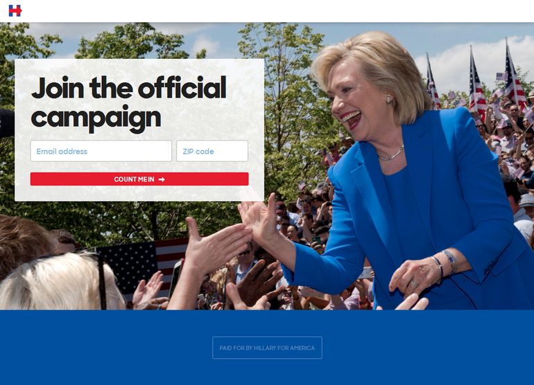
And the winner is…
Variation #2!
Did you get it right? Leave a comment to let us know!
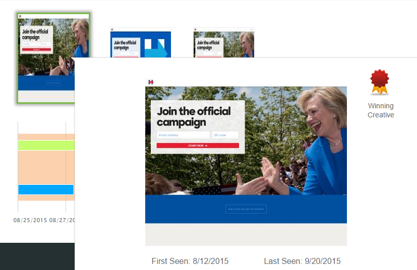
Hillary’s team also ran another test with a logo in place of a picture of Hillary. Here’s what those two variations looked like.
Variation #1:
Variation #2:
And here’s the winner according to iSpionage’s A/B test monitoring:
#2: Dr. Ben Carson
The only two A/B tests we found by the Ben Carson campaign were button color tests—gold versus blue on the homepage and blue versus red on the sign up page.
Test #1: Gold versus blue “Learn More” button
Test #2: Red versus blue “Sign Up” button
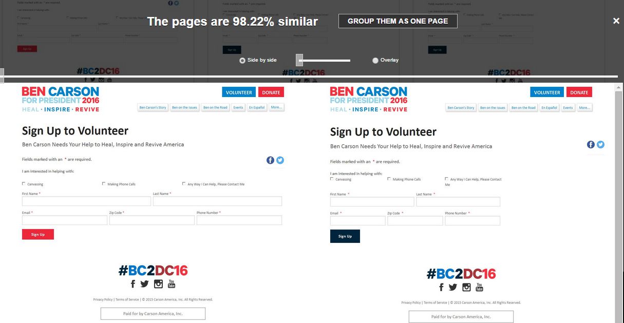
If these are the only A/B tests that Dr. Carson’s team has been running, then they’re really missing out because button color tests are some of the most simple tests you can run and are the least likely to deliver a big win. This doesn’t mean you shouldn’t test button colors; it just means that you shouldn’t expect button-color tests to deliver breakthrough results that boost donations by 49%.
#3: Carly Fiorina
We didn’t find any true A/B tests with the Carly Fiorina campaign but did see a different homepage variation that was being used before the current homepage was implemented. Here’s what it looked like.
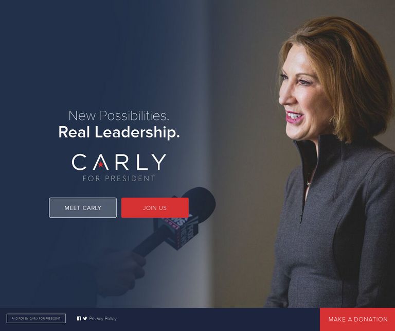
I personally think this page is better than the current page that’s being used, and for Carly’s sake, I hope that the current page was A/B tested and not just implemented blindly without testing to see how it affects conversions.
#4: Donald Trump
We didn’t find any A/B tests for Donald Trump’s campaign which either means they aren’t running any noticeable tests (which is probably the case since we picked up A/B tests for all of the other candidates), or else they all snuck under the Campaign Watch radar which means we didn’t pick them up.
Here are the final grades by candidate for A/B testing:
- Hillary Clinton: A
- Ben Carson: D
- Carly Fiorina: D
- Donald Trump: F
It’s important to note that we may not have caught 100% of the tests which means some of the candidates may deserve better grades based on A/B test results we weren’t able to pick up. With that said, it’s unlikely that these candidates have been running as many meaningful A/B tests as the Hillary Clinton campaign otherwise we would have more results to show like we do for Hillary’s website.
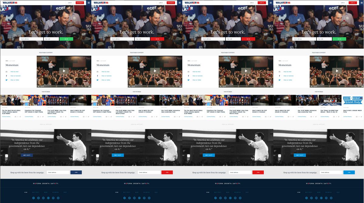
Another A/B Test Example
Scott Walker is another candidate that was running A/B tests, as you can see in the screenshot below, but since he’s dropped out of the campaign, we’re not going to include screenshots of all of his A/B tests. (And once again, this is a button color test which won’t deliver breakthrough conversion optimization results.)
Who’s Campaign Slogan Is the Strongest?
The final item we want to look at for each candidate is their campaign slogans.
Campaign slogans are important because they communicate what each candidate stands for in only a handful of words. The right campaign slogan can go a long way towards inspiring support, while a weak one doesn’t to much to help a candidate.
Here are the different campaign slogans as they stand now (i.e. as seen on their websites):
- Hillary Clinton: This starts with you.
- Dr. Ben Carson: Heal, Inspire, Revive
- Carly Fiorina: Carly for America
- Donald Trump: Make America great again.
And here’s a quick breakdown of each.
Hillary Clinton: This starts with you.
There’s a lot to like about this campaign slogan. It focuses on the voters instead of Hillary and implies that she’s going somewhere while communicating that she can’t do it without support from individuals like you.
Dr. Ben Carson: Heal, Inspire, Revive
What I like about this campaign slogan is that it speaks to issues and communities in America that need healing and need to be revived. What I don’t like is that these three words don’t really hit home related to specific causes I care about, especially inspire. Reviving the American economy would be nice, but this campaign slogan could do more to convey a specific message.
Carly Fiorina: Carly for America
I like that Carly’s campaign slogan mentions America, which is really what these campaigns are all about, not the candidates, but I don’t like that it doesn’t offer anything other than to say that Carly is for America.
Donald Trump: Make America great again.
Of all these campaign slogans, I like this one the most, but there’s a back story to that.
Before candidates started out on the campaign trail, I told my wife one night, “Presidential candidates should use a campaign slogan that focuses on America, making America great again, and restoring America’s prominence, not on themselves.” I’m not sure whether or not I used the exact phrase “Make America great again,” but I thought a campaign slogan along those lines would work well with America’s current political and economical standing.
Either way, I like the idea of candidates campaign slogans focusing more on America and the people of America and less on themselves. With that in mind, Donald Trump has a strong slogan (in my opinion) which hopefully will make up for some of the other holes his campaign seems to have from a digital marketing perspective.
Here are my final campaign slogan grades:
- Hillary Clinton: A
- Ben Carson: B
- Carly Fiorina: B
- Donald Trump: A+
Wrapping It Up
I hope you found this analysis useful for better understanding the digital marketing strategies of each campaign team. Based on what I’ve seen so far, I consider Hillary to be the winner when it comes to her digital marketing strategy. The other candidates have some catching up to do, but it’s very possible they can close the gap over the next couple of months by running the right A/B tests and optimizing their websites to capture more conversions by increasing donations and email subscribers.
The Author
 Joe Putnam (@josephputnam) is the Director of Marketing at iSpionage. He’s helped organizations increase SEO traffic over 400%, conversion rates 133%, and AdWords conversions 10X. Get in touch with him via Clarity to improve your content marketing, SEO, PPC, and CRO results.